In 2021 I had a new camera for my birthday, including a tripod with a super-smooth pan motion. Where better to try it out than at Brentor, I thought, a magical place with 360 degrees views all around.
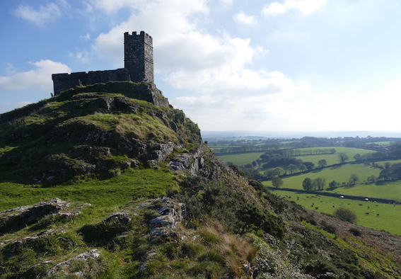
On a wonderful mid-September afternoon I set up my tripod on a ledge near Brentor Church. I almost slid down a few metres trying to move around the panning camera without watching my feet. Of course, I also took various photographs, including this one, which struck me as a perfect subject for a new reduction lino print.
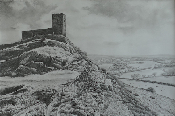
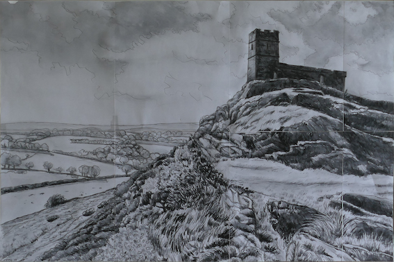
My starting point for a new print is often a pencil drawing. Drawing the subject matter carefully allows me to get to know it and specifically consider the tonal values. Whether you work in black and white or in more colours, the tonal gradations are always crucial in a lino print.
I wished to make this an ambitious print, in a large image size of 42x60cm, which is basically the widest I can print on my small etching press. With a reduction print you’re never sure whether it will work out and, of course, bigger prints also demand a bigger investment in paper, ink and time, so it’s important to prepare as well as you can. I usually scan my design drawing to ‘flip’ it into its mirror image, and print that out (in sections) for tracing onto the lino block.
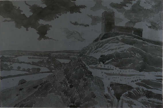
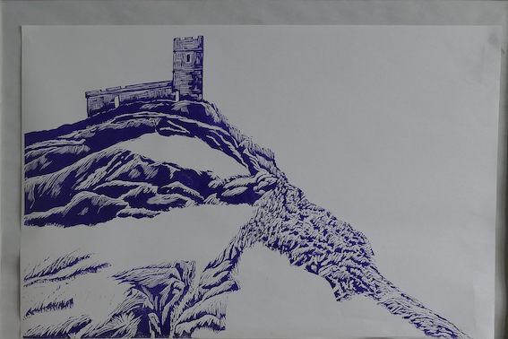
The printing normally begins with the lightest colours, at this stage sometimes hardly visible. Everything that wants to stay white – the colour of the paper – has to be cut away first. After the first stage printing the lightest sky tones over the horizon are cut away, so that in stage two printing it’s already possible to ink up the lilac for the distant Dartmoor hills.
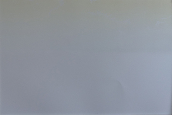
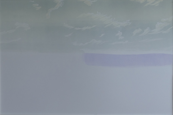
With sky and foreground now separated (the lino where they meet now cut away), stage 3 & 4 are all about adding blues to the sky (in two ‘graded’ ink-ups), as well as the lighter yellow-ish tones that will come to stand out on the Brentor mount and in the landscape in front of those Dartmoor hills. This print is an edition of 20 (plus 2 artist’s proofs), so each stage is printed 22 times…
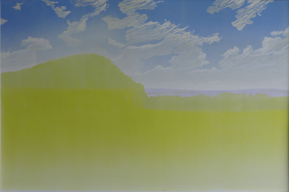
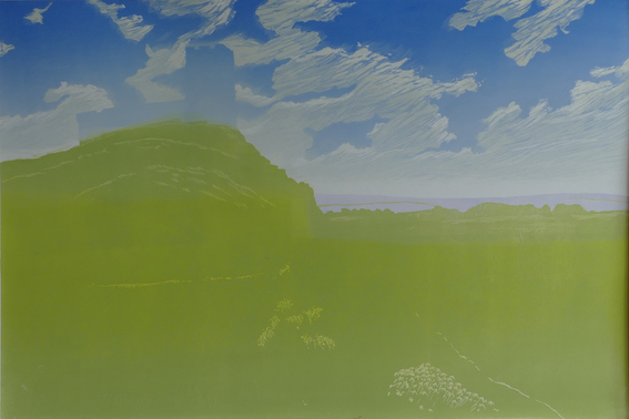
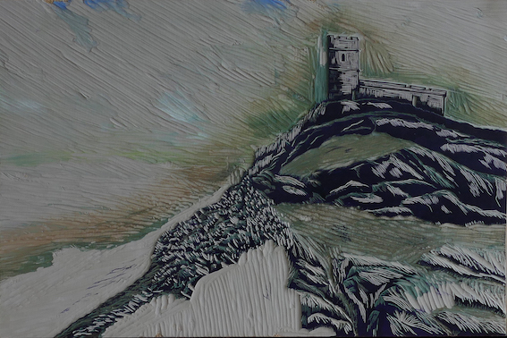
The next two print stages are about the brighter greens in the foreground, as well as the hazier blue-greens used in the middle distance landscape, between the Brentor mount and the Dartmoor hills. (A third blue-green is to be added there in the next printing round.) At this stage all the lino block surface used for the sky has been completely cleared away.
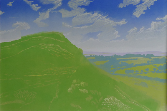
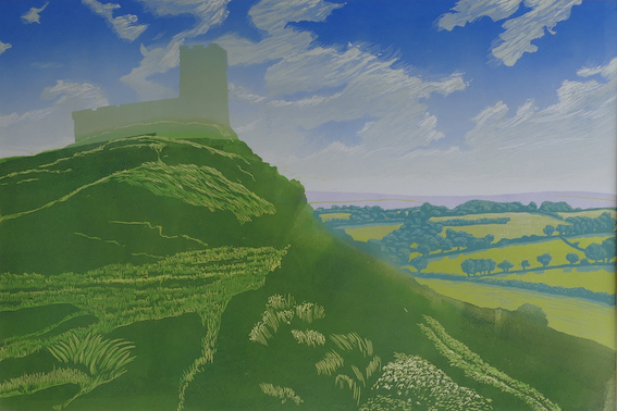
Note how in stage 6 I added a grey-ish tone on the church building, to later light up its brighter side. In stage 7 I have inked-up a light blue to bring highlights to the rocks on the mount. Stage 8 introduces the warmer foreground colour that really pushes the landscape behind the mount backwards. Of course, more lino surface is cut away between each of the printing stages.
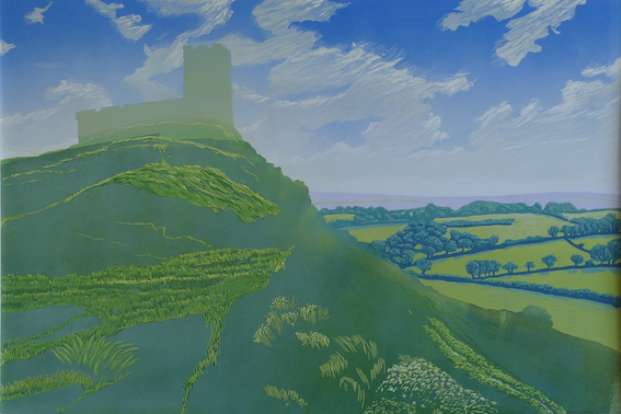
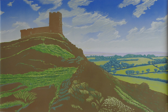
With such a complicated print it’s normally only at the later stages that I start to feel ‘safe’ and being on the home-straight. But there is still more detail to be added in both tonal values and texture to bring life and depth into the foreground. Naturally, you can only work in the lino surface that is still left on the block. However, it’s worth giving this just as much attention as the earlier stages, until you reach the final layer to complete the image….
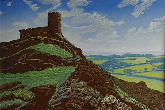
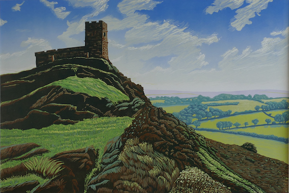
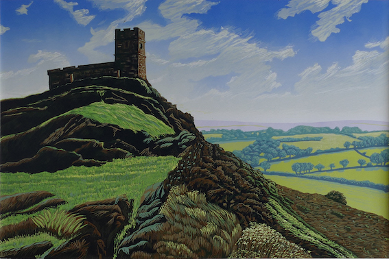
I hope you’ve enjoyed reading about the cutting and printing process that I put myself through to create a complicated, multi-layered lino print such as this one. People sometimes ask me whether I’m concerned about giving away ‘trade-secrets’, but I always feel it’s good to share my personal enjoyment and passion for trying to push lino printing to the limits. I’m pleased to say that this new print has had a good reception, with the first numbers in the edition already on their way to new owners. If you might be tempted, you can find ‘Brentor’ (and other works) in my gallery shop, both as the original print (click here) or as an A5 card version, and of course you can always get in touch via email.
